**The central task of a data scientist is to analyze large amounts of data. Afterwards, the data scientist must present the results clearly, e.g. with comprehensible visualizations. Visualizations are essential for understanding contexts.**
Generated with Bing DALL-E
The Plotly Express Python library enables the creation of interactive charts easily. It’s a high-level API for creating figures. In this article, we’ll introduce you to three impressive visualization options. **Be curious!**
## What is Plotly Express?
[Plotly Express](https://plotly.com/python/plotly-express/#overview){:target="_blank" rel="noopener"} is a built-in part of the [Plotly library](https://pypi.org/project/plotly/){:target="_blank" rel="noopener"}. The `plotly.express` module contains functions for creating entire figures with less effort. That makes the module a good starting point for creating figures. A Plotly Express function uses graph objects internally.
The function returns a `plotly.graph_objects.Figure` instance. You can also build the figures with graph objects manually but with between 5 and 100 times more code. We recommend that you start with Plotly Express. You can use the graph objects if the plots become more complicated.
## Technical requirements
### Prerequisites
You’ll need the following prerequisites:
* Installed [Python](https://www.python.org/downloads/){:target="_blank" rel="noopener"} and [Git](https://git-scm.com/book/en/v2/Getting-Started-Installing-Git){:target="_blank" rel="noopener"}
* Installed [conda](https://docs.conda.io/en/latest/) and pip
* Access to a bash (macOS, Linux or Windows)
* Code editor of your choice (We use [VSCode](https://code.visualstudio.com/download){:target="_blank" rel="noopener"}.)
### Create virtual environment
Keep your main system clean by creating a virtual environment. We use [conda](https://docs.conda.io/en/latest/){:target="_blank" rel="noopener"} to create a virtual environment. Enter the following command in your terminal:
```bash
conda create -n plotly-plots-env python=3.9.12
# answer the question Proceed ([y]/n)? with y.
```
You can activate the conda environment with the following terminal command:
```bash
conda activate plotly-plots-env
```
### Install dependencies
We need the following dependencies for this article. Please install the Python packages `plotly` and `numpy` in the virtual environment.
```bash
pip install plotly numpy
```
## Dataset
In this article, we use the built-in dataset gapminder of the package [plotly.express.data](https://plotly.com/python-api-reference/generated/plotly.express.data.html){:target="_blank" rel="noopener"}. You can find more information about the dataset at [gapminder.org](https://www.gapminder.org/data/){:target="_blank" rel="noopener"}. Initially, we have to import the dataset.
```python
import plotly.express as px
df = px.data.gapminder()
df = df[df['year'] == 2007]
```
We only select the data for 2007. Now, we take a look at the dataset.
```python
df.head()
```
We get the following result:
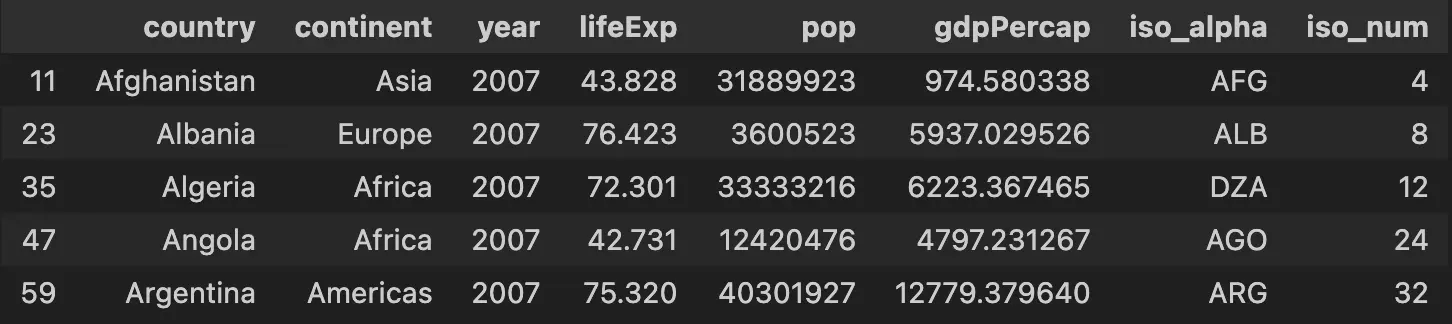
**The dataset contains the following variables:**
* **country:** Name of the country
* **continent:** Name of the continent
* **year:** Year of record
* **lifeExp:** Life expectancy in the country
* **pop:** population size of the country
* **gdpPercap:** Gdp per capita of the country
* **iso\_alpha:** ISO 3166 ALPHA-3 Country code
* **iso\_num:** ISO 3166 Numeric Country code
## Bubble Chart
A bubble chart is a scatter plot with a third dimension as a marker of different sizes. You can find the `px.scatter()`function parameters on the [Plotly reference website](https://plotly.com/python-api-reference/generated/plotly.express.scatter.html){:target="_blank" rel="noopener"}. The code looks as follows:
```python
fig = px.scatter(df, x="gdpPercap",
y="lifeExp", size="pop",
color="continent", hover_name="country",
log_x=True, size_max=60,
title="Bubble Chart: Countries Statistics for 2007")
fig.show()
```
We get the following interactive bubble chart:
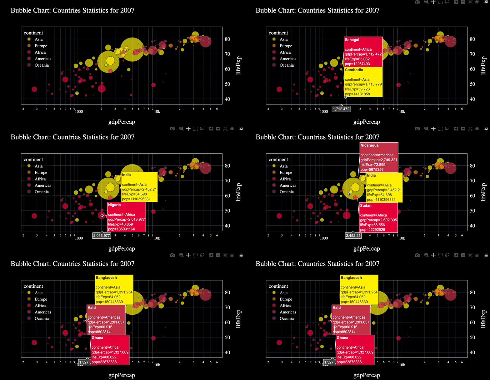
On the x-axis, you see `gdpPercap` and on the y-axis `lifeExp`. Each color represents a specific continent. You can hover over the bubbles and see more information about the countries. The size of the bubble reflects the size of the country’s population.
## Sunburst Chart
A Sunburst chart allows you to visualize hierarchical data. You can find the `px.sunburst()` function parameters on the [Plotly reference website](https://plotly.com/python-api-reference/generated/plotly.express.sunburst.html){:target="_blank" rel="noopener"}. Look at the following code:
```python
import numpy as np
fig = px.sunburst(df, path=['continent', 'country'],
values='pop', color='lifeExp',
color_continuous_scale='RdBu', hover_data=['gdpPercap'],
color_continuous_midpoint=np.average(df['lifeExp']),
title='Sunburst Chart: Countries Statistics for 2007')
fig.show()
```
The result is the following interactive plot:
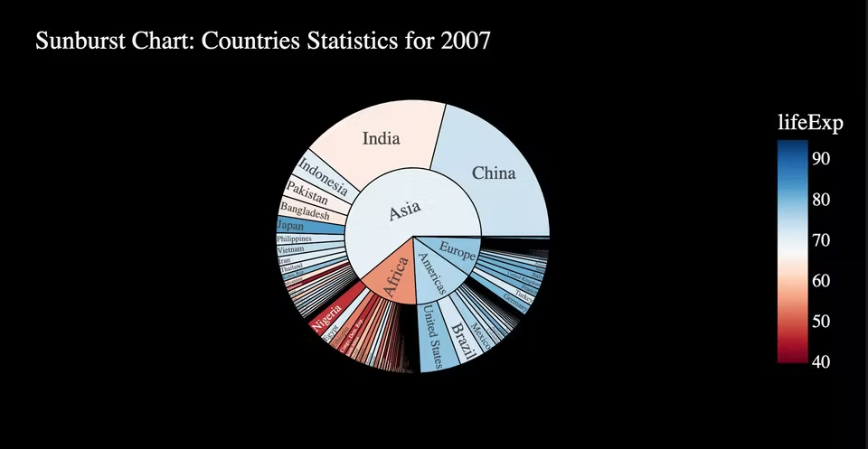
You can see a pie chart with the continents in the inner circle. The more population the continent has, the larger the section are. You can delve into the continent sections. Then, you see the continent in the inner circle. The individual countries are in the outer circle. In addition, you can hover over the individual section and learn more about the continent or country. The color scale on the right indicates the life expectancy by color.
## Treemap Chart
Treemap charts visualize hierarchical data through nested rectangles. You find the `px.treemap()` parameters on the [Plotly reference website](https://plotly.com/python-api-reference/generated/plotly.express.treemap.html){:target="_blank" rel="noopener"}. Look at our example code:
```python
fig = px.treemap(df, path=[px.Constant("world"), 'continent', 'country'],
values='pop', color='lifeExp',
hover_data=['gdpPercap'], color_continuous_scale='RdBu',
color_continuous_midpoint=np.average(df['lifeExp']),
title='Treemap Chart: Countries Statistics for 2007')
fig.show()
```
We get the following result:
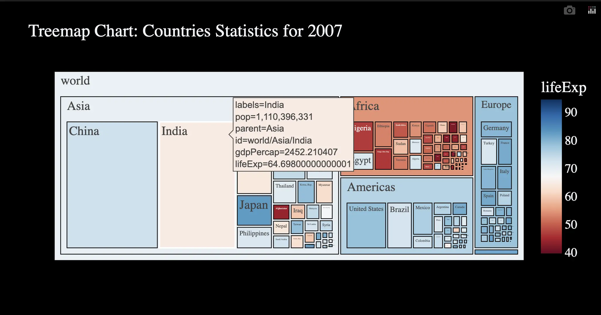
Treemap Charts are similar to sunburst charts. There are several levels. The more citizens a continent or country has, the larger the rectangles are. Furthermore, you can delve into the rectangles. Look at the GIF above. The color scale on the right again indicates the life expectancy by color.
These three presented charts serve as examples for Plotly Express. Plotly Express provides more than 30 functions for creating different types of plots. Check out the [Plotly Express website](https://plotly.com/python/plotly-express/){:target="_blank" rel="noopener"} and find the right plot for your project.
## Conclusion
In this article, we showed you how to use Plotly Express to create interactive plots. You learned how to create a Bubble, Sunburst and Treemap chart with the gapminder data. Plotly Express is easy to use. You can use it directly in your next data science project.
Thanks so much for reading. **Have a great day!**
💡 Do you enjoy our content and want to read super-detailed guides about AI Engineering? If so, be sure to check out our premium offer!